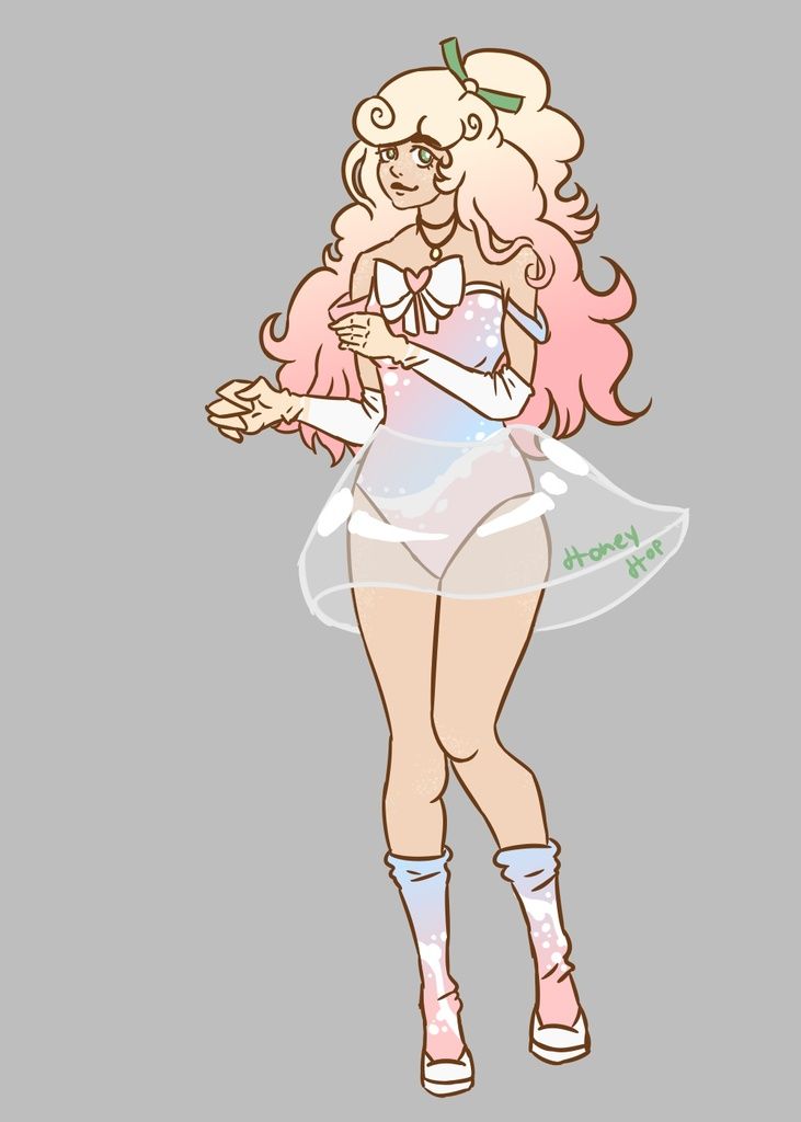
- by Holypandas |
- Painting And Drawing
- | Submitted on 05/12/2009 |
- Skip
- Title: An angel
- Artist: Holypandas
- Description: Just a plain angel picture, can I have CONSTRUCTIVE advice please?
- Date: 05/12/2009
- Tags: angel
- Report Post
Comments (7 Comments)
- Holypandas - 05/16/2009
- thanks
- Report As Spam
- icey blossom - 05/15/2009
-
she looks pretty cute =)
2 movement lines around her legs could help to show her flying movement,
More definite outlines could define her a bit better, and shading would add interest. - Report As Spam
- donngee - 05/14/2009
- ugh! sweatdrop
- Report As Spam
- Holypandas - 05/14/2009
- The avatar I was drawing didn't have a nose.
- Report As Spam
- shinonono - 05/12/2009
- Aside from what other people said about the anatomy and shading, you need work on the face. The face is not a circle, is is more like a rounded oval. The eyes are too smushed in and well, I hate to be mean but it's pretty hard to look at. And there isn't a nose.
- Report As Spam
- Holypandas - 05/12/2009
- ok, thanks for the advice
- Report As Spam
- Zeefruit - 05/12/2009
-
Is she doing the breaststroke to get around? ;D
Looking at any person from the side, you'll notice their torso is not at all as straight as you drew it no matter how skinny or muscular they are. It usually forms a sort of S-shape and the ribcage tends to show on skinnier people. Arms and legs (including feet, hands, buttocks) also have much more shape to them than this. Maybe try studying human musculature charts on the Internet in order to get an understanding of how the human body works. - Report As Spam


