- by Musiical Soulz |
- Painting And Drawing
- | Submitted on 07/23/2009 |
- Skip
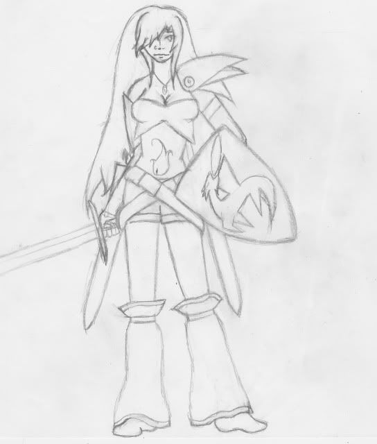
- Title: Character Sketch - Laria
- Artist: Musiical Soulz
-
Description:
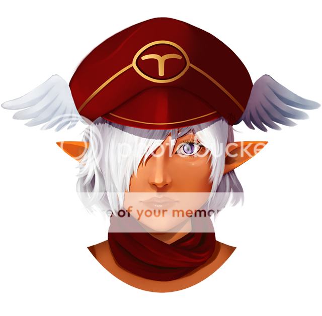
This is my main character Laria. I often use her when roleplaying... her hair and eyes are purple and she's tall, like over 6 feet...
I LIKE CONSTRUCTIVE CRITICISM! IF YOU ARE SIMPLY SAYING THAT ITS STUPID OR THAT YOU HATE IT, DON'T BOTHER POSTING. IF YOU ARE GOING TO TELL ME SOMETHING THAT YOU DON'T LIKE ABOUT IT BE SPECIFIC AND TELL ME HOW I CAN FIX IT!!! - Date: 07/23/2009
- Tags: character sketch laria
- Report Post
Comments (7 Comments)
- brighter8 - 04/04/2011
- its a pretty good drawing id have 2 say i meen i can draw but not like that
- Report As Spam
- Musiical Soulz - 07/25/2009
- thanks for the advice smile i havent inked yet because i want to know what i can work on and see if i can change/make it better... she has a nose ring which makes her nose look bigger and you cant really tell it's there with the scan... and it could use some more movement and less hair
- Report As Spam
- SilverJackal - 07/25/2009
-
Overall suggestion for this as well would be to get a good set of Inking pens. Either Prisma inking pens or Microns. Hell even a fine point and a bold point Sharpies would do it. In doing that you are able to clean up your work,and make it much better as well as finalize/fix what would be a mess if tried to do in Pencil.
Hope this all helps. (phew and I'm done) - Report As Spam
- SilverJackal - 07/25/2009
-
2. The face for the most part looks decent, but the nose seems a little big (dont know if thats how you wanted it) and the one eye seems kinda too small.
3. The clothes for the most part seem ok. though I'm sure on the more flowing clothing articles such as the leggings there would be creases within the cloth as well... Also they like the hair seem to be dead or without movement. (still a little more to go) - Report As Spam
- SilverJackal - 07/25/2009
-
The overall concept is good, but there are parts that dont seem to look "natural" or correct. Here's my little list.
1. The hair looks much to stiff and too big as if you've got a wig on her that does not move and is over her actual hair so the head thusly looks really big. (will continue in other comments) - Report As Spam
- l La Reveuse l - 07/24/2009
-
I agree, work on the face.
And maybe maybe the legs more curvy.
If you're going for the sexy, feminine "warrior" look. - Report As Spam
- Legendary Pirate Plasma - 07/23/2009
- I have to agree with VolliballStar. The face... it's a little too masculine for the feminine body it was placed on. But other than that, very nice job! 4/5 from me!
- Report As Spam


