| Ya like my pic ? |
| yes |
|
100% |
[ 1 ] |
| no |
|
0% |
[ 0 ] |
|
| Total Votes : 1 |
|
|
|
|
|
|
|
|
 Posted: Tue Jun 05, 2007 8:10 pm Posted: Tue Jun 05, 2007 8:10 pm
i agree, make it darker.... BUT REALLY GOOD!!! blaugh 10 OUT OF 10!!!
|
 |
|
|
|
|
|
|
|
|
|
|
|
|
|
Posted: Tue Oct 09, 2007 4:17 pm
love it! i say 9/10. heart
|
|
|
|
|
|
|
|
|
|
|
|
|
|
|
|
|
|
Posted: Wed Jan 09, 2008 6:54 pm
|
|
|
|
|
|
|
|
|
|
Posted: Tue Jan 22, 2008 4:55 am
5 out of 10, It is good but too dark
|
|
|
|
|
|
|
|
|
|
|
|
|
|
|
|
|
|
Posted: Mon Feb 04, 2008 5:55 pm
[.TheYoungGentleman.] Hey people this is a sketch i done of this hot goth chick XD lmao Tell me what you think and how i can improve 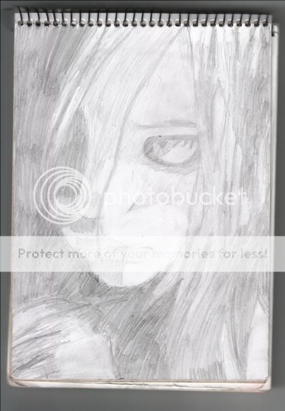 i think her nose is tooooo toooo big and she is like emo evil exclaim she looks like shes about to comit siucide burning_eyes other than that it looks really good xd
|
|
|
|
|
|
|
|
|
|
|
|
|
|
|
Posted: Sun Feb 10, 2008 5:49 pm
alright love, work on the size and shape of the eye, its a bit tooo bubbly for realism. and the eyelashes, make multiple dashes outward, dont make them points. hey eyebrow could be a tiensy bit fuller, make the eyebrow also with dashmarks, alrighty darling? other than that... i'd give you a..........hmm
7.5/1o
|
|
|
|
|
|
|
|
|
|
|
|
|
|
|
|
|
|
Posted: Thu Feb 14, 2008 2:19 pm
Don't take this the wrong way I am only saying that you need to take into consideration that the while the picture is nice but the shading and the hair, there is basically no difference to it. You need to put more detail into the hair to make it seem more realistic. The facial aspect to this drawing not that bad but the lips seem to distorted because of the shading once again. The eyes, not that bad, too much makeup or around the eye is making it more of a demonic look, unless your going for it. But the nose, you did a wonderful job on the nose, better than what I can do. XD
|
|
|
|
|
|
|
|
|
|
|
|
|
|
|
Posted: Mon Mar 03, 2008 3:14 pm
needs darker lines its ok hot chick man...im straight....i give it a 5 
|
|
|
|
|
|
|
|
|
|
|
|
|
|
|
|
|
|
Posted: Sat Mar 08, 2008 7:59 am
I really love the shape of the eye!
The lips are great, too.
I'll give it an 8/10.
|
|
|
|
|
|
|
|
|
|
|
|
|
|
|
Posted: Wed Mar 26, 2008 8:35 pm
I give it a 7/10 because the shading is unrealistic. I like the basic drawing of it though, especially the eye. But the color all seems to be the same. you shade things to portray shadows; making it darker. There's no point if it's all the same shade. (try using different pencils?)
|
|
|
|
|
|
|
|
|
|
|
|
|
|
|
|
|
|
Posted: Wed Mar 26, 2008 8:38 pm
LeeAnnaa [.TheYoungGentleman.] Hey people this is a sketch i done of this hot goth chick XD lmao Tell me what you think and how i can improve i think her nose is tooooo toooo big and she is like emo evil exclaim she looks like shes about to comit siucide burning_eyes other than that it looks really good xd I disagree. I like the way she has the face, but her eyes sad. it doesnt mean she's going to go off to kill herself, and ever if she did, so what? maybe that's what she wanted it to look like. but honestly, did you take the picture and copy if from the web(but yu re-drew it?) because normally that's where you see shading problems, from people who do do that. *nods*
|
|
|
|
|
|
|
|
|
|
|
|
|
|
|
Posted: Tue Apr 15, 2008 6:10 pm
xp It definetly needs many more values
(shades, tones whatever you wana call them)
look at a grayscale
doing that will give your sketch more depth
ninja
also, skin, hair, and eyes all have highlights
so come back into yor drawing with an eraser or white pastel/conte crayon/colored pencil whatever you choose to use
have fun with your drawings heart
|
|
|
|
|
|
|
|
|
|
|
|
|
|
|
|
|
|
Posted: Tue Apr 15, 2008 6:14 pm
p.s.
dont worry over the fact that your drawing is unrealistic
I like your style, and you should stick with it
unless it interferes with your job/ school
ninja
my teacher is a jerk about drawing anime, but I do it anyways
sweatdrop
and just because you draw cartoons does not mean that it dosent need values...jeez
heart
|
|
|
|
|
|
|
|
|
|
|
|
|
|
|
Posted: Tue May 27, 2008 1:36 pm
Your pencil lines are kinda messy...Maybe make it a bit neater even though it's a sketch. Good, though
|
|
|
|
|
|
|
|
|
|
|
|
|
|
|
|
|
|
Posted: Thu Jun 19, 2008 7:47 pm
It's good but make some of the values that are supposed to be dark Darker, most of the values un your sketch look the same.
Try cross hatching with your pencil.
|
|
|
|
|
|
|
|
|
|
|
|
|
|