Welcome to Gaia! ::

The Any Topic Guild

Back to Guilds

I will find you... on Gaia! :D 

Tags: friendship, events, hangout, literate, chatting 

Reply Creative Crossroads
ATG Sketch/Doodle/WhatNot/Scraps Thread Goto Page: 1 2 [>] [»|]

Quick Reply

Enter both words below, separated by a space:

Can't read the text? Click here

Submit

Sentama Lin

PostPosted: Fri Feb 29, 2008 12:14 am
I've realized that we don't really have a general place to share works of art that's not quite large enough for its own thread, and yet not small enough to be insignificant to share. We all have little doodles that we want to share and show off for laughs, or perhaps for actual critiques. It may be nice, then, to have a thread to show off these "doodles" of sorts.

It doesn't have to be restricted to a visual art. If there are songwriters, singers, instrumentalists, dancers, or any type of small little artistic doodle that wants to be shared, this is a place. :3

I don't need to tell you all, but be respectful to the doodles and the doodles' owners. Give comments if wanted. :3  
PostPosted: Fri Feb 29, 2008 12:20 am
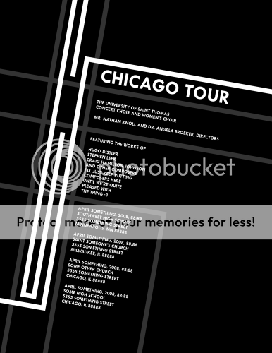
Draft of Choir Tour Posters

My choir, in its genius, didn't keep any money for PA purposes so they asked the students to make posters. I decided to try my hand at it and here's what I came up with. This is a draft as of 2008-2-29:

User Image
 

Sentama Lin


Thaliat Everwood

Profitable Conversationalist

9,000 Points
  • Tycoon 200
  • Conversationalist 100
  • Forum Sophomore 300
PostPosted: Fri Feb 29, 2008 6:10 pm
I like the sleekness of the poster design!  
PostPosted: Fri Feb 29, 2008 6:13 pm
User Image
I like it. It look classy yet modern, if you know what I mean. It would totally catch my attention!
User Image
 

God-Raped-Me


Sentama Lin

PostPosted: Wed Apr 09, 2008 11:13 am
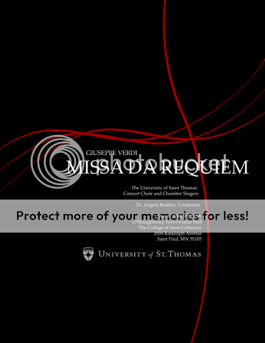
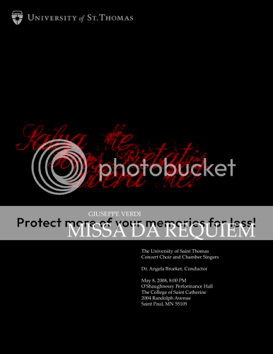
Two more posters. My choir director liked the first one so much and since she very much hates the posters the school makes for performances she asked me to make another one for this next concert. These two are drafts; I haven't decided which one I'm going to use:

User Image

User Image
 
PostPosted: Wed Apr 09, 2008 3:05 pm
Well, as I already stated on dA, I prefer the one with the stylized cross. It helps to bring the different elements together. Not to mention that I can't read the script in the other one.  

124-C


Kerrigan_dragon

PostPosted: Thu Apr 10, 2008 2:49 pm
I like them both, but I'd have to say that I much prefer the first one. 3nodding  
PostPosted: Fri Apr 11, 2008 10:55 pm
I agree with those two...first one is the way to go 3nodding  

Alarias

Militant Dabbler

12,900 Points
  • Risky Lifestyle 100
  • Peoplewatcher 100
  • Treasure Hunter 100

124-C

PostPosted: Thu Apr 17, 2008 9:46 pm
User Image

So, yeah, Lin mentioned something about business cards last night (read: Early this morning) which prompted me to post this. It's a calling card I've been working on the past couple of days.

So, say stuff, or not, doesn't really matter.

Oh, and don't call me. It's ******** annoying and ticks me off.  
PostPosted: Thu Apr 17, 2008 10:00 pm
The card is very you in style, I like the cleanliness of it.

The only thing that throws me off slightly is the text on top (your email and whatnot). Though I'm not sure if it will help my eyes, perhaps some empty padding for that information would help make it seem less odd. It just seems too close to the edge of the card.  

Sentama Lin


124-C

PostPosted: Thu Apr 17, 2008 10:06 pm
It's very close to the edge, practically touching it. The placement of the contact info is what I've been having the hardest time settling. Do you think it would be better if I use the same margins for that as I did my name at the bottom?  
PostPosted: Thu Apr 17, 2008 10:26 pm
It would be better, though I'm not sure if there's a way to make it totally work. I can see why you're having trouble placing it; I'm having difficulties with my card as well (especially dealing with the annoying CD hole).

Anyways, I think the same margins as your name on the bottom will help immensely. Other than that it's just moving it around.

Also, what fonts did you use. The contact font looks like a italicized Euro-styled font.  

Sentama Lin


124-C

PostPosted: Thu Apr 17, 2008 10:56 pm
I'll play around with placing info on one of those CDs and see what I can figure out. What are you thinking? Home phone, cell, work, fax, email, web-address, home/office address...

I used NewMedia Fett Kursiv for the contact info and RedStar for my name. Both are free for personal use, which I assume includes calling cards, though business cards may be different.  
PostPosted: Thu Apr 17, 2008 11:02 pm
I actually found a way to do around with the holes: don't use them altogether. I just realized it might just be better to make sleeves for those cards. But I'll keep playing around with my sketchbook and other things. I'm thinking, at the very least, cell phone and email address. I would put in my (future) website as well but that's getting a bit much.  

Sentama Lin


124-C

PostPosted: Fri Apr 18, 2008 3:47 pm
I don't really like that idea. If you're going to do that, you may as well just skip using the small CD all together. Actually, it would be kind of cool to use a transparent sleeve or small envelope with extra info that interacts with the info on the card itself. Maybe make a logo that fits into the center cutout.

Anyway, there's plenty of room around the hole for the info. These, of course, are just quick mock-ups. I've got one good idea I want to try out.
User ImageUser Image


Font is Rational Integer.

[EDIT] It looks really shitty, but it gets the idea across, I guess...
User Image
Gotta wonder how MS Word can word wrap but Photoshop can't. Can it?  
Reply
Creative Crossroads

Goto Page: 1 2 [>] [»|]
 
Manage Your Items
Other Stuff
Get GCash
Offers
Get Items
More Items
Where Everyone Hangs Out
Other Community Areas
Virtual Spaces
Fun Stuff
Gaia's Games
Mini-Games
Play with GCash
Play with Platinum